The Landscape Becomes the Backprint
(5 min read)
It started with three elements.
Mountains.
Forest.
River.
The challenge was not adding more.
It was deciding what could remain.
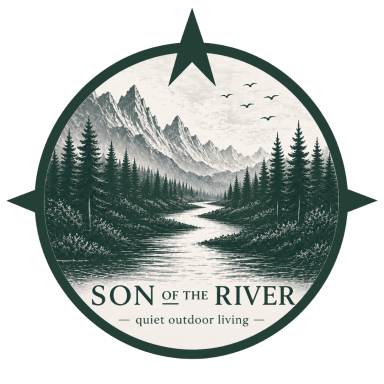
The first Son of the River backprint was never meant to be a complicated illustration.
It needed to feel familiar.
Like looking across a river towards a tree line.
Like mountains appearing beyond the forest.
Like a landscape remembered rather than photographed.
And it needed to work on one particular colour.
River Moss.
Starting with the landscape
The landscape has been part of Son of the River from the beginning.
Mountains in the distance.
Forest closer to us.
Water moving through the centre.
Not because the brand is about reaching remote wilderness.
Quite the opposite.
These elements represent something simpler.
The kinds of places that make us slow down.
A riverbank.
A shaded path.
A line of trees.
A landscape that asks us to look for a little longer.
The backprint began as a way of bringing that feeling onto the garment without turning it into a loud graphic.
Less illustration. More symbol.
There was a temptation to add detail.
More trees.
More texture.
More movement in the water.
Small elements in the sky.
But every addition changed the feeling.
The landscape became busier.
More decorative.
And less like Son of the River.
So the process gradually moved in the opposite direction.
Simplify.
Remove.
Clarify.
The mountain silhouette needed to remain complete.
The forest needed enough variation to feel natural without becoming visually noisy.
The river needed to stay recognisable without being overdrawn.
Elements that did not add meaning were removed.
The goal was not to create the most detailed landscape possible.
It was to keep only what the landscape needed.
Designing for River Moss
The garment colour was never supposed to be just a background.
River Moss is part of the artwork.
That changed the way the illustration needed to be built.
Instead of covering the entire print area with ink, parts of the design could remain open and allow the fabric itself to become another visual tone.
The hoodie becomes part of the landscape.
Not simply the surface beneath it.
That helped keep the print quieter while still giving the mountains, forest and river enough depth to remain visible from a distance.
It also meant that every colour decision had to be made in relation to River Moss.
Two colours were enough
The final backprint was reduced to two printed colours.
River Cream brings the lighter areas into the landscape.
Shadow Moss creates depth and separates the darker elements from the River Moss garment underneath.
No full-colour photograph.
No gradient-heavy illustration.
No unnecessary third or fourth ink colour.
Just two inks working together with the colour of the garment itself.
That limitation became part of the design.
Because sometimes fewer colours make every decision more visible.
River Cream
River Cream is used where the landscape needs light.
It brings contrast to the river and selected parts of the illustration while connecting the backprint to the lighter side of the permanent collection.
For production, the selected reference is:
Pantone 7534 C.
The exact printed result is still evaluated on the actual River Moss fabric, because ink never exists independently from the garment beneath it.
A colour on a screen is only the beginning.
The physical print is what matters.
Shadow Moss
The second printed colour is Shadow Moss.
A deeper green that stays within the natural palette of Son of the River rather than introducing a hard black into the landscape.
Reference:
Pantone 5535 C.
Its role is subtle.
It adds separation.
Depth.
Structure.
The trees can remain darker than the River Moss garment while still belonging to the same colour world.
The result should feel tonal rather than graphic for the sake of being graphic.
Why screen printing
For the first River Moss pieces, the landscape is prepared for two-colour screen printing.
There is something appropriate about that process for this design.
Each colour has a purpose.
Each layer needs to align.
And the artwork has to be prepared for the physical reality of ink, fabric and production rather than simply looking correct on a screen.
Fine lines need to survive printing.
Small gaps need enough space.
Lettering needs to remain readable.
Shapes need to hold together.
What looks perfect at 300% zoom on a monitor may behave very differently once it becomes ink on heavyweight fabric.
That is where graphic design becomes product development.
The screen changes the drawing
Preparing artwork for screen printing means looking at the illustration differently.
Not only:
Does this look good?
But also:
Can this line print consistently?
Is this gap large enough?
Will this area fill in?
Does the text remain legible?
How does the darker ink interact with River Moss?
Does the landscape still read from a normal viewing distance?
These questions led to a series of small adjustments.
Some were barely noticeable individually.
Together, they changed the quality of the final artwork considerably.
The mountains became cleaner.
The treeline became more controlled.
The river became easier to read.
Spacing around the lettering was refined.
Unnecessary details disappeared.
The design became quieter as it became more production-ready.
The size matters too
A backprint changes completely depending on its scale.
Too small, and the landscape loses its presence.
Too large, and the garment begins to feel dominated by the graphic.
For the Heavy Hoodie, the target width was set at approximately 30 centimetres.
Large enough for the landscape to be clearly visible.
Small enough to leave River Moss around it.
That surrounding space matters.
The print should sit on the garment.
Not consume it.
From screen to fabric
There is always a moment in product development when digital certainty ends.
Files can be measured.
Colours can be specified.
Placements can be documented.
But eventually the design has to leave the monitor.
Ink meets fabric.
The hoodie moves.
The print bends.
Natural light changes the colours.
Someone actually wears it.
That is why the first printed samples matter.
They answer questions a mock-up cannot.
Is the placement right?
Does the 30-centimetre width feel balanced on different sizes?
Is River Cream bright enough against River Moss?
Is Shadow Moss distinct without becoming too dark?
Do the finest parts of the forest still hold their shape?
Does the print feel like part of the garment rather than something placed on top of it?
Those are the details we want to see before anything becomes final.
Not finished until it works in real life
There is a tendency to treat the finished digital artwork as the end of the design process.
For us, it is another step.
The first printed sample may confirm every decision.
It may also change some of them.
A colour may need adjustment.
Placement may move slightly.
A line may need more weight.
Something that looked subtle on a screen may feel too prominent on fabric.
That is not failure.
That is the reason samples exist.
We would rather change a detail after seeing the real garment than pretend the first version was automatically the right one.
River Moss carries the landscape
The first collection follows a simple visual principle.
River Moss carries the landscape backprint.
River Cream stays quieter and cleaner.
That gives the two colours different characters without creating two completely different collections.
River Moss expresses the landscape.
River Cream leaves more space.
Both come from the same idea.
Fewer pieces.
Clearer decisions.
More reason for each piece to exist.
From landscape to garment
Mountains.
Forest.
River.
Two printed colours.
One River Moss garment beneath them.
What began as a landscape gradually became something that could survive the move from screen to fabric.
That transition matters to us.
Because Son of the River should not exist only in renders, moodboards or ideas.
It should work when the fabric folds.
When the print moves.
When the hoodie gets worn.
When it comes back from a walk with a little dirt on the sleeve.
The landscape does not need to stay perfect.
It needs to become part of the piece.
The landscape becomes the backprint.